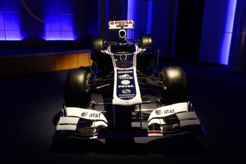
Williams unveiled its definitive 2011 livery at Grove today, and it was no surprise to see blue and white predominate.
However the red stripes and other details give a little echo of the hugely successful Rothmans era, which ended in 1997. Given the rumblings about Renault’s decision to actively emulate the JPS era, it seems an odd choice.
There are no surprises in terms of the sponsors on the car, and there appears to be space for more.
Intriguingly Sam Michael said that Williams had not abandoned the flywheel KERS concept, which could be seen on the car in 2012.
“Williams Hybrid Power developed a flywheel, and we did consider a flywheel for this car. It was very close, but unfortunately the packaging stopped us doing that to start with.
“Obviously WHP work on flywheels in other industries, but we also haven’t discounted introducing a flywheel to this car at some point. It will be very unlikely for 2011, but it will definitely be on the cards again for 2012, flywheel versus battery.”


Maybe the late reveal was deliberate so as to judge the reaction to the Renault “JPS” look before committing to it.
Slightly Rothmans-esque or not, that is definitely a fantastic livery.
I wonder if part of the reason for the Rothmans era livery is to remind potential stock investors of the glory days. It’s quite clever if that is in fact the reason. I’m not sure what affect it will have though. If i was an investor I’d study the performance of the last 3 years of the team and invest based on that. I suppose some of the investors may be F1 fans or Williams fans, and it might pull at their heart strings and tip them over the edge causing them to get their cheque book out.
Hm. Anyway I hope they do well this season and they are competitive.
The real question is, are there other sponsors? We keep hearing that the portfolio is full for the year, but one would usually expect to have had the new sponsors revealed with this livery. Everyone know that RBS and Philips are gone, but there doesn’t seem to be anyone taking their place. I also still find it curious that for a team called “at&t Williams” that the at&t logos continue to be rather small on the car.
If anyone this year is entitled to have a ‘retro’ livery for lack of a better term, it is Willliams. More noticable than the livery was the absence of Patrick Head and Sir Frank. This is all well crafted to give potential sponsors the impression that Williams has turned the page and is entering a new chapter in it’s storied history. I wish them all the best, and look forward to seeing them on the podium this year.